I feel like I have been away forever...I have a couple simple cards I made as I got back to creating, that use black and a contrasting red, or red with a contrasting black as their main colors...I love just a POP of color, either way, for dynamic contrast...
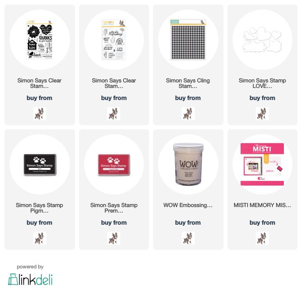
The first one uses stamps from Simon Says Stamp's latest release, Rest and Refresh, Home Sweet Home. I used my MISTI to stamp the house/sentiment image, wanting to make sure the house was fully filled in with black ink. I then clear embossed the house and colored only the heart and it's leaves. I added a couple more sentiments from the same set and clear embossed those, as well. Here's a close up...
The second one, I used a couple of the sentiment stamps from the new set, Summer Time...when I read the sentiments, I just couldn't resist using them in a subtle and simple way(see if you get it...I HOPE you get it:):)!!)...
I stamped the Simon Gingham background stamp at an angle. That is why the gingham stamped panel is smaller than usual. The gingham pattern, if used as is, goes straight across the card. I wanted a diagonally striped piece of paper, so I had to cut the panel down a bit, until it fit onto the background stamp. I die cut a heart out of the stamped panel, and popped up over the stamped sentiments. Here's a close up...
Oh, it's so great to be back...here's hoping to lots of fun and time to create in July!!
Thanks for visiting me today!!
Hugs!! Lisa


Both are great cards but I especially love the picnic one - and I get it! Great use of the gingham background. It turned out the smaller layer is perfect. Wonderful cards as always!
ReplyDelete